If the soundtrack to Zayna’s road to her final project draft presentation included “Truckin’,” my theme this week was “White Rabbit.” After two evenings of chasing unfortunate rabbits to a dead end, I’m working my way to something that is really do-able.
Nothing really major has changed from my design presentation except that I have a new pure CSS rollover navigation, which helped me to better architect my site from a page perspective. I was able to stick to the minimum number of elements in the primary navigation and then all the sub-pages in the secondary. The result is that I have a navigation item for every page on the site, which was really important to me.
To address redundancy and consistency I created entry pages for each section of the site (just 2) and then mirrored that on the home page. I built the site in anticipation of people entering through search, so I wanted to make sure that no matter how you enter, you know what you’re getting. (A pipe dream, maybe, but I have to address the search aspect since I ran my targeted keywords through Google’s search tools and found that over several thousand searches occur each month on my major keywords.)
I also added some slight design elements to try to clarify the cohesion between the soft handwriting and the masculine typewriter font. I did address the concern that there was too much red on the site and now reserve the red purely for navigation and some style things. Also, sadly, the blood, much as I love it, was a little too much once I put all the content in, so it got the boot.
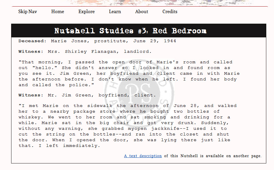
As part of my trip down the rabbit hole, I had a bit of fun playing with an alternate design, which I scrapped. I wanted to share since I worked hard on it. This is a screenshot.

Finishing up some final things and will post a link once it’s up.
I commented on Lisa’s design project, Zayna’s progress with her heels and howitzers image and Erika’s rats.
I took advantage of the torrential rain yesterday and made some great progress on my design assignment. All of my assignments to date have been designed in such a way to allow me to play with my final project design, so I tried to take all the neat things that I liked from my past style sheets and incorporate that into my design for this week. I’m working my way toward the final design of my project and since it’s very much a work in progress, I appreciate any feedback you all have.
I have 3 pages to my design assignment for this week:
Home (top nav)
Nutshell Studies (top nav)
Dark Bathroom (linked from Image map on Nutshell page)
The visual design is a hodgepodge of my text and image assignments with some significant changes added in.
- I widened the site to a huge 940px to accommodate my big images. The images are the focus and I think it’s insane to shrink them to fit a very narrow column. I also increased the size of my text to fit.
- I expanded the navigation and added some visual elements, like top and bottom borders. I also added some breathing room to the nav bar by adding some space between the buttons. Since Dreamweaver’s spacing with embedded fonts is a bit of a crap shoot, this required a lot of trial and error.
- Speaking of embedded fonts, I originally used a very nice sans-serif font, Droid Sans. Given the new design and the time period the Nutshells depict (mostly the 1940s), Droid seemed a bit too modern. I found a nice slab-serif font, Copse. Since “Copse” is reminiscent of “corpse” and I figured that meant it was a keeper. (I’m kidding.. I think it looks nice alongside my typewriter font.)
- I played with some of the details, including my little curly quotation images. I positioned them relative to my pullquote box so that they hang off the top left corner and bottom right corner. I set the opacity to 30% and finally got my red to mute enough so that they’re not totally distracting. Please tell me if they’re still too much.
Now on to the big stuff.
I finally got my Dark Bathroom page to render correctly and do what I wanted it to do with the images. I’m very pleased with how this turned out. I ended up using definition lists, so that I could pin the “definition” to the specific spot on the image.
I fully recognize that I have images that can’t be described in alt text in less than 50 characters, so I’ll be creating long description pages for all of my Nutshell images to meet accessibility requirements. Dreamweaver makes this pretty easy and I like this solution. I feel that it’ll let me describe the images and still preserve the aesthetic of the detail pages, which is really important to me.
Finally, between Carrie’s help and the NoobCube tutorial, I also made an image map to use for the links to my four Nutshell details, which you can see on my Nutshell page.
I’m still working on the actual written content, so forgive my Latin and gibberish.
Carrie and I had a discussion about her fabulously yellow design project and her image map on her blog. I also commented on Alexa’s plea for kick-ass and innovative history sites. I also commented on Kellie’s thoughts on interactivity and 3-D.
I’ve accomplished 3 minor victories, and now, the weekend is over, which means my ever-growing project to-do list is going to have to wait until Wednesday. Still, I am very pleased with myself. Not everything is how I’d like it and I can’t for the life of me figure out pop-up positioning, but I’ll get to that in due time. (If any of you have figured out how to position a popup over a specific point, let me know. Laura, I think you were wrestling with popup footnotes, yes?)
Anyway, here are my victories, minor though they may seem:
- Blood Spatter: Lest you think you cannot download special Photoshop brushes specifically to create blood spatter prints, I assure you, you can. You can, and I did. I tried every combination and shade of red that I could think of, but I finally have some blood spatter that is enough to hint at crime and yet not so much that you worry you’ve made your way to a horror site (at least that is my hope.)
- Dissolving Header Into Background: I tried to make my header fade into the background. And I tried. And I tried. I learned 10 interesting and new effects, like making ragged edges using a layer mask, and eating away at the image so that it looks like critters chewed on it. No, really. But alas, none were really the effect I was looking for. Finally, I figured out how to fade an image into a transparent background and my header now does this.
- Image Maps/Popup Image Details: And last, but certainly not least, I turned a wide shot of a Nutshell into an image map and created 5 hotspots that pop a detail image and some text. It’s very much work in progress as there are no indicator points to tell the user where to hover to see the detail; the hotspot is pretty far away from where I actually want it; and there’s no explanatory text anywhere, but it works.
All of the above can be seen here. Please remember, this is my sandbox. I’m not quite done building out my castle.
I feel like I just climbed Everest.
Here is my challenge and if anyone has ideas on a solution, your next latte is on me. I placed my image, carefully measured out where the hotspots should be and coded them accordingly in my CSS (with coordinates on the x-y- axes). Furthermore, I used Dreamweaver’s handy little drag and drop placing function and put them Exactly. Where. I. Want. Them. And yet when I upload, they are still out of place. I have a feeling that I need to reset something to zero so that the browser doesn’t override my settings, but I can’t figure it out. Any help you might have would be greatly appreciated.
Additionally, I’d like to use bigger images, but then I run the risk of expanding my site beyond the 14-16-words-per-line sweet spot to which we must all strive. What do you think? Should I go bigger and run the risk of having longer sentences?


